InstruMMents Brand Identity
Founders of InstruMMents wanted to re-think and evolve capturing and using dimensions. They created the world’s first dimensioning instrument that captures dimensions or reference curves of any object, straight or curved.
Services:
Brand Concept and Strategy, Brand Identity, Brand Guidelines, Typeface Design, Mobile App UX/UI, Website Design, Packaging Design, Exhibit Design, Social Media, and Email Communication Assets.
Result:
Upon release of the first product, InstruMMents received over 2 Billion impressions in the press, media, and social. The product has enjoyed sale conversions of up to 3% on ads served, earning “blockbuster” status.


At the core of the brand name “InstruMMents” is “MM” or “millimeters” representing dimensions and measuring process.


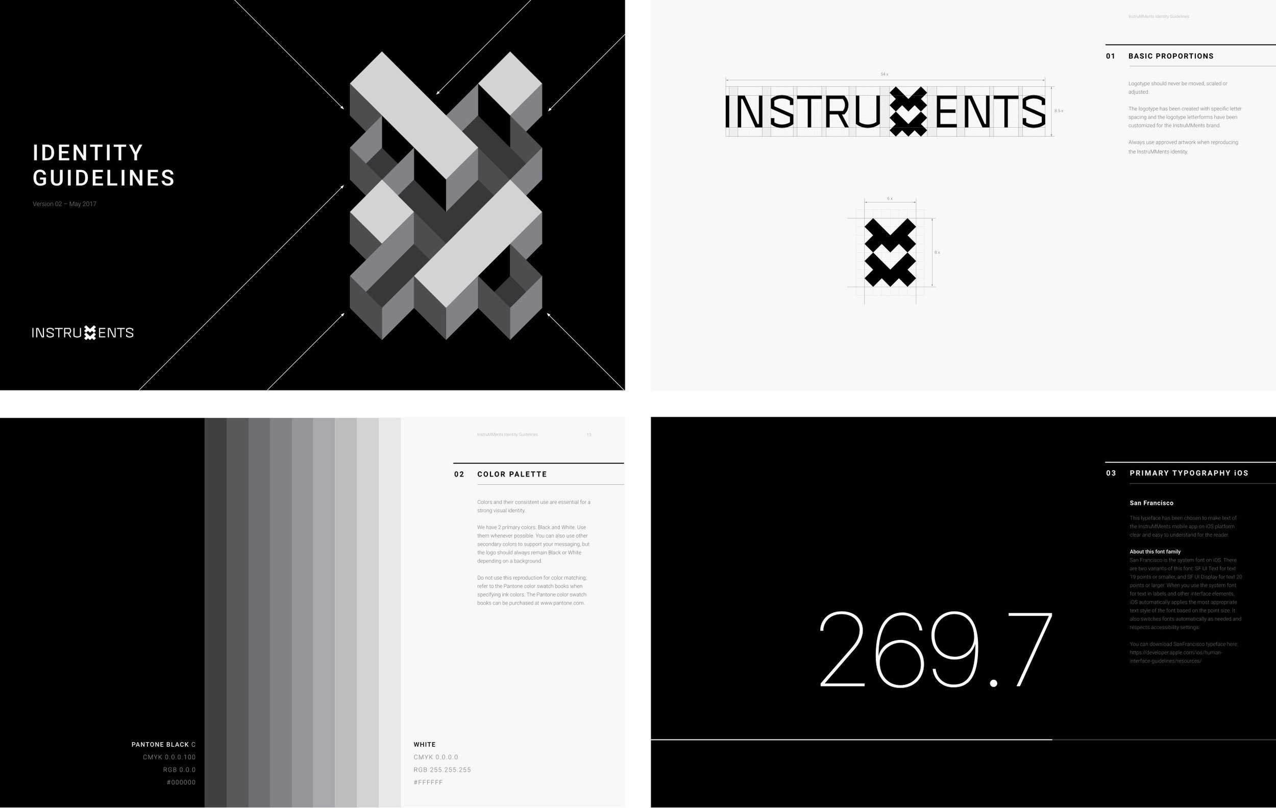
Brand mark is constructed from the individual blocks, squares, representing the measuring units of an area. The heart symbol inside is communicating love and passion at the center of any creation.


The iconic angular shape of the MM mark is recognizable even when reconstructed with other graphic elements. This makes the communication of the brand flexible and versatile.

Various marketing illustrations based on the iconic shape of MM's brand mark.

At the core of the marketing icons, there is the same visual DNA as in the brand mark: bold outline, 45-degree angle, simple and clear forms, black and white colors, strict proportions. The construction of every icon is based on the same grid system and it helps unify the elements and proportions of every symbol.


To make the brand communication more personal I lead the creation of the sans-serif, display typeface, consisting of Light, Regular and Bold fonts. With the absence of adornment, this functional typeface is fully reflecting the precision and efficiency of the InstruMMents tools.


The Identity Guidelines is the evolving document and currently consists of 94 pages. There are the following chapters: Logo, Color Palette, Typography, Stationery, Photo and Video Style, Grids and Layouts, Patterns and Illustrations, Industrial Design, Packaging, Mobile app and Website, Social Media Communication and Presentation.


The packaging design and experience is fully representing the brand essence of InstruMMents. The primary product consists of the black box that is standard for all devices, and the interchangeable sleeve, which can be different depending on the product SKU.
Instead of a boring manual, customers can find the instructions in a nice high-quality notebook. They can read the instructions and later use it for their notes and sketches. People really enjoy it!


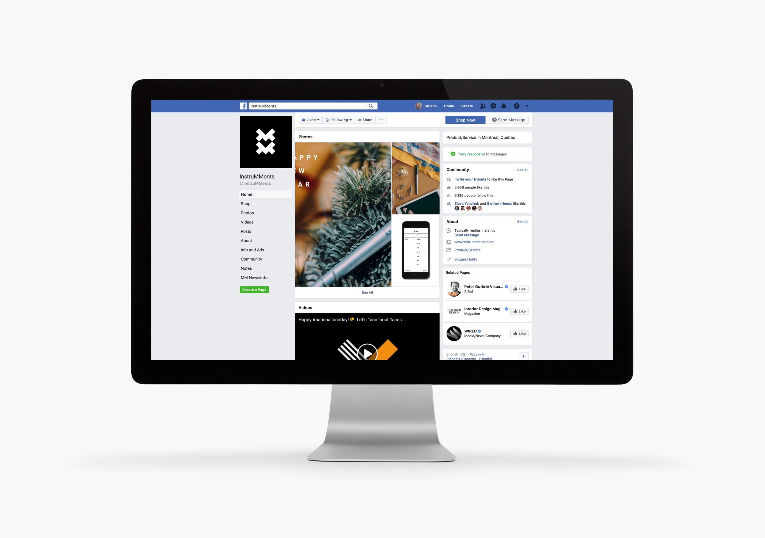
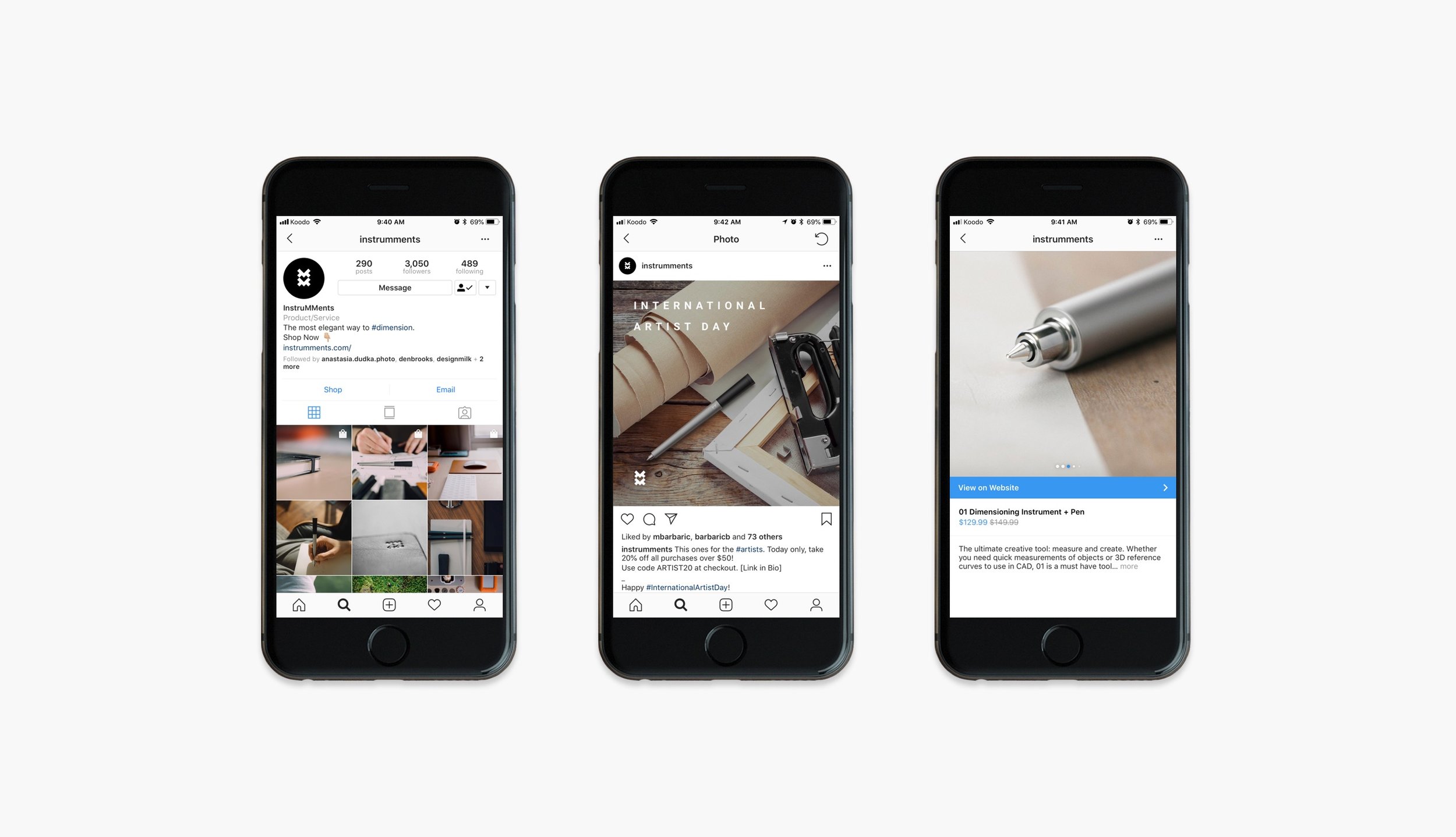
Social media brand communication assets.


Website and shopping experience.


The iconic shape of the InstruMMents stand was at the center of attention in the SZIDF-2017 show (Shenzhen, China).

