


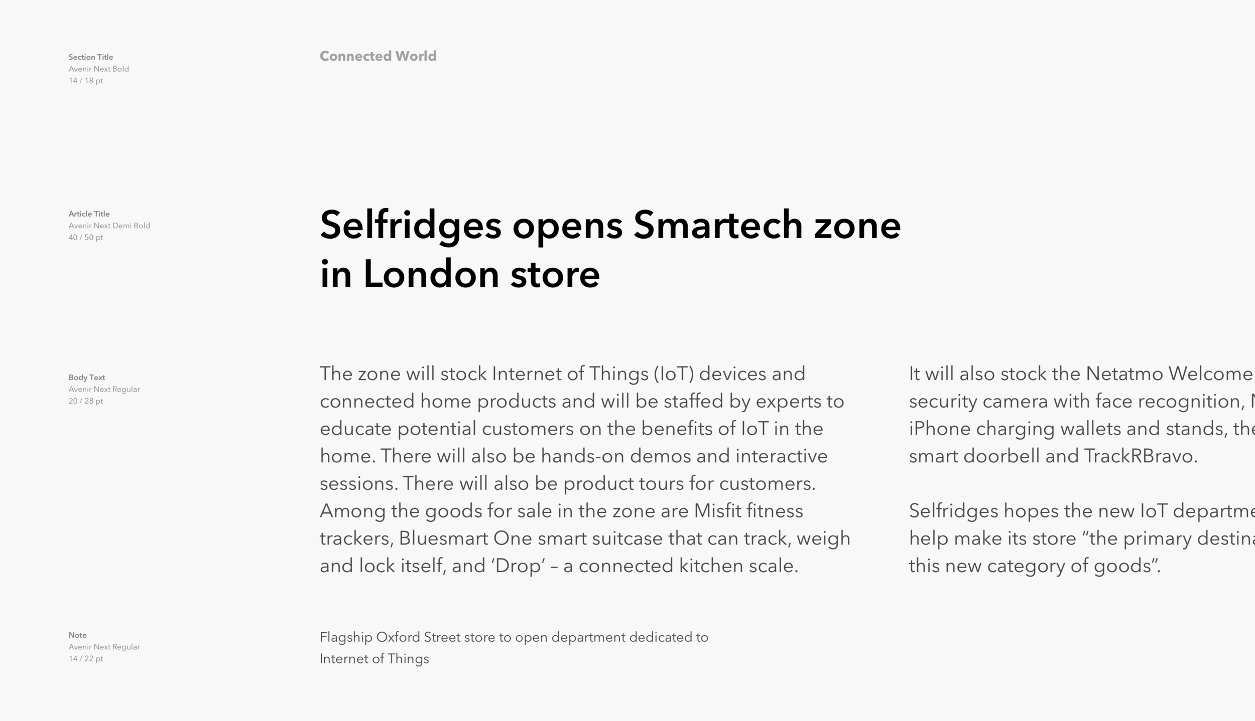


Selfridges opens Smartech IoT zone in London store. It’s Europe’s and UK’s first innovation hub housing a unique collection of the best innovations, IoT devices, and connected products from the industry, all under one roof – vying to make Selfridges the primary destination for IoT.
My task was to create a flexible and dynamic identity system for the brand, communicating a unique approach of Smartech to retail: taking products down from the shelves and building a transparent and passionate culture by providing visitors with interactive POS, competitive pricing, and highly trained and knowledgeable staff.
Services:
Brand Concept and Strategy, Brand Identity, Animation.
Result:
As a result of the rebranding, the new brand is now highly recognizable in the competitive market. Smartech successfully launched 4 new stores: Manchester, Berlin, Paris, and Amsterdam. Brands like Snap Inc., Prynt, TrackR, and Ring are selecting Smartech to exclusively launch their products in Europe.
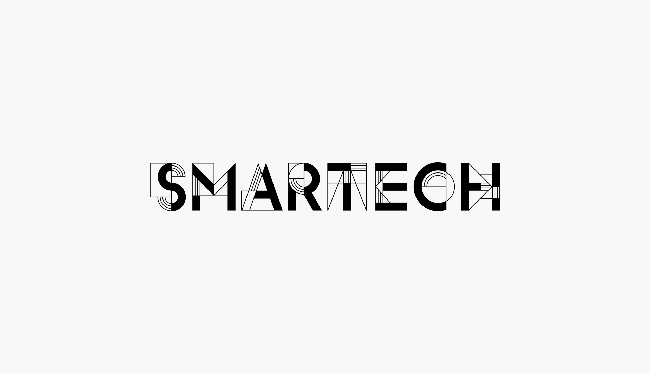
At the core of the logo concept is a combination of the components and connections representing a technology network.
This is the primary horizontal version of the logo. The high contrast combination of thick and thin lines makes a very unique recognizable brand look.
The construction of every letter is based on the grid system that helps unify the elements and proportions of every letter.
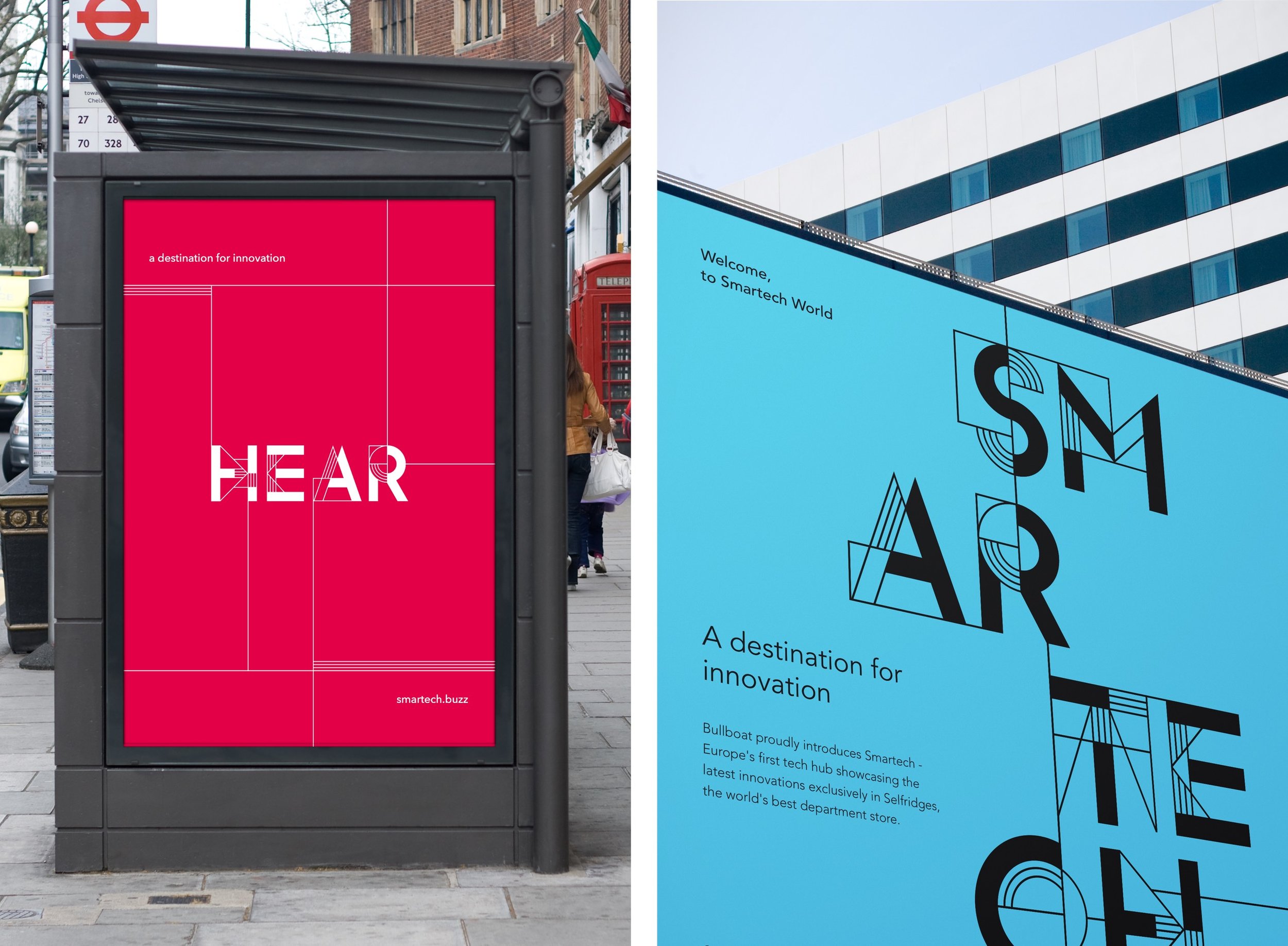
The flexible and versatile module system at the core of the identity in combination with the vibrant color palette is communicating the playful and open character of the brand.
Such a system approach allows us to have unlimited combinations for brand communication and helps to easily adapt a message to any display format.
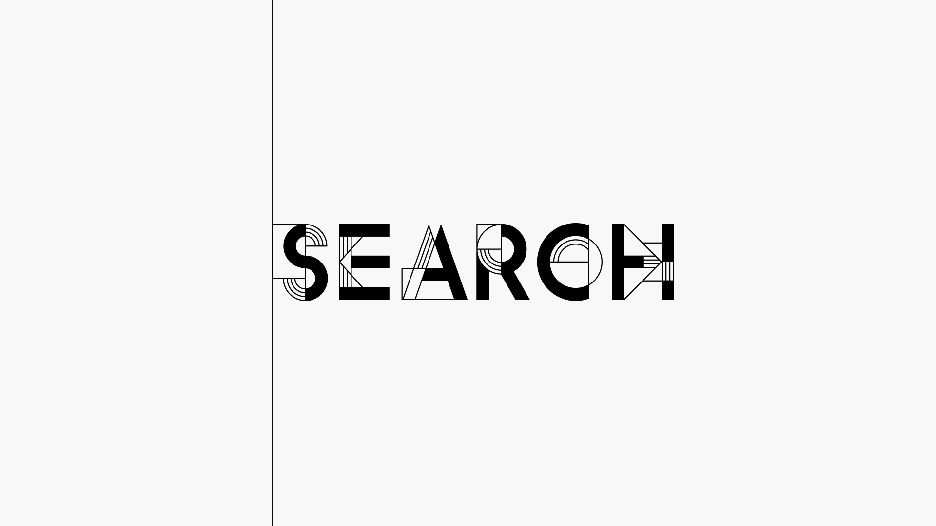
With such a distinctive look every letter becomes the brand mark. Any single letter or combination of letters can act as the stand-alone logo representing the brand.
Inspired by the nature, vibrant color palette makes the brand friendly and approachable.
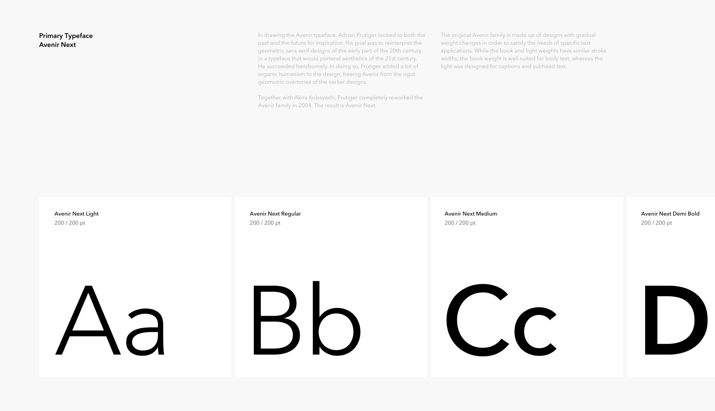
Versatility. Any word, written in our typeface, can communicate a message and identify the brand at the same time.
Visually, the icon set is the continuation of the logo and it has the same DNA at the core: basic geometric forms, the combination of thick and thin lines, one color. Nevertheless, the icons are clear, recognizable, and functional. The construction of every icon is based on the grid system that helps unify the elements and proportions of every symbol.